The Lens design system.
Tokens, components, and patterns — drawn directly from the shipped CSS in src/tokens.css and src/reader.css. This page is the visual mirror; the CSS is the source of truth.
Brand
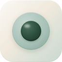
The Lens mark is a single deep-forest dot with a soft sage halo — a reading lens reduced to its essence. The wordmark sets in Inter Bold. Together they're our identity across the extension, the marketing site, and the Chrome Web Store.
The mark
Centered deep-forest dot (#2A4D3A) with a radial gradient highlight, set inside a soft sage halo on warm cream. Designed for legibility at every size from 16px favicons to 512px app stores — the dot scales linearly, the halo softens at small sizes via the source PNG.
Mark at every size
 16favicon
 32favicon
 48extension128store
 180iOS
The brand dot — surface tests
The dot is a self-contained mark. It works on every surface in the system without redrawing — the halo opacity adjusts to keep contrast steady.
Lockup
Clear space & minimum size
- Clear space = the diameter of the dot's halo, on all four sides. Don't crowd it.
- Minimum size = 16px for the bare dot (no halo at this size — the inner gradient does the work). 32px when paired with the wordmark.
- Background = always one of the four documented surfaces above. Never on a busy photo. Never on pure black or pure white.
- Color = the dot stays deep-forest
#2A4D3Aacross every theme. Only the halo opacity shifts.
Colors
Warm cream hierarchy. Pure white is never used. Two-tone sage system + deep-forest accent. Every pairing is WCAG 2.2 AA verified on the canvas swatch.
Surfaces
Text & ink
Accent — two-tone sage + forest
Semantic
Typography
Atkinson Hyperlegible for reading prose (designed by the Braille Institute for low-vision legibility). Inter for UI — buttons, labels, chips, badges.
Spacing
4px base. xxs/xs/sm/md/lg/xl/xxl/section — same scale Anthropic uses internally.
Radius
Six tiers. Buttons get 8px (md), cards 12px (lg), modals 16px (xl), pills 9999px.
Elevation
Subtle. The shipped buttons use a 1px drop plus an inset top highlight.
.lens-btn { box-shadow: 0 1px 2px rgba(20,20,19,.06), inset 0 1px 0 rgba(255,255,255,.5); }
.lens-card { box-shadow: 0 2px 4px rgba(20,20,19,.10); }
.lens-popover { box-shadow: 0 12px 36px rgba(20,20,19,.12); }
.lens-modal { box-shadow: 0 24px 60px rgba(20,20,19,.16), 0 4px 10px rgba(20,20,19,.06); }
UI icons
Lens deliberately uses Unicode glyphs and symbols instead of a custom icon font — fewer fonts to load, perfect rendering at any DPI, screen-reader-friendly. Every glyph below appears literally in the shipped product.
Toolbar & actions
Floating panel
Status & states
// Why Unicode, not SVG/icon font?
// 1. Zero extra HTTP requests, zero font swap flash
// 2. Renders crisp at any DPI and scale
// 3. Inherits color from text — themes "just work"
// 4. Screen-reader-readable without ARIA labels for common glyphs
// 5. Tiny — adds 0 bytes to the bundle
Store assets
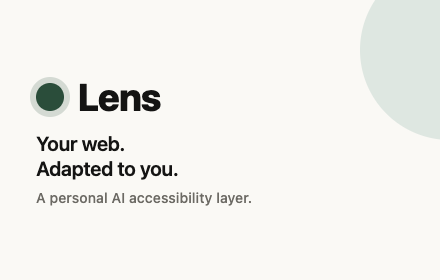
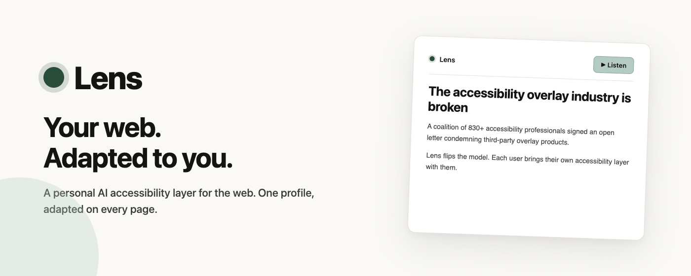
Chrome Web Store marketing tiles. Both tiles use the same cream canvas, the same dot mark, and the same Atkinson Bold wordmark — they read as one product across every listing surface.
Tiles
Favicons
Three sizes served from the site root. theme-color is set to #FAF9F5 so the iOS Safari status bar and Android Chrome address bar paint cream, not a dark seam.
16browser tab32retina tab48bookmarks180iOS homeButtons
8px radius. 10/16 padding. 40px min-height. Inter Medium 14px. Dark ink text on sage primary with a darker sage border (WCAG 3:1 UI contrast).
Variants
Sizes
States
Inputs
Same metrics as buttons (40px min-height, 8px radius, hairline border, focus ring uses deep forest accent).
Reading-level slider
The single most important control in Lens. Five steps. The label updates live in the pill.
Toggle
44 × 24 track, 20px knob. On-state uses the deep forest accent.
Badges & chips
Badges are read-only status. Chips are clickable persona tags or language picks.
Badges
Persona chips
Segmented control
Used for theme picker and discrete mode switches.
Top toolbar — reader mode
The bar that appears at the top of every adapted page. Hairline divider below. Brand mark on the left, actions on the right.
Floating panel — selection actions
Appears next to a text selection. Dark surface so it doesn't compete with the editorial cream behind it.
Save / share row
Lives under the article body. MP3 hidden by default (opt-in in Options).
Save or share 847 words · 4 min
Error card
Used when Anthropic is overloaded, rate-limited, or content is genuinely unrecoverable. Always offers an actionable next step.
A temporary capacity issue on their side, not Lens. Retrying once automatically — if it still fails, wait a few seconds and click Adapt again.
Loading skeleton
The shimmer pattern used while the article streams in. Respects prefers-reduced-motion.
Reader view
The full picture: browser shell + Lens toolbar + adapted article body + floating selection panel.
Why this matters: a short, plain explainer
By the desk · Adapted by Lens · 4 min read
The story is simple. Yesterday afternoon a small earthquake hit the south. No one was hurt. Buildings are fine.
What we know
The quake was 3.4 on the Richter scale. People felt it for a few seconds. The army says all bases are safe.
Options page
Opens when the user clicks the browser action. Same component vocabulary as the reader — inputs, sliders, chips, toggles.
Lens settings
Your profile, API key, and add-on features.
API KEY
Get a key at console.anthropic.com — Lens never sees or stores your traffic.
READING LEVEL
YOU READ LIKE
ADD-ONS
Adds an MP3 button under the article. Uses OpenAI's TTS — bring your own key.
Source of truth
This page is a visual mirror. The authoritative tokens live in
src/tokens.css and components in
src/reader.css. The canonical written spec is
LENS_DESIGN.md. Change CSS → every Lens page updates and the spec doc should be bumped.
Versioning: this is v1.1, last regenerated 2026-05-22. When you bump
tokens or component metrics, update the version label at the top of
this page and the front-matter in LENS_DESIGN.md.